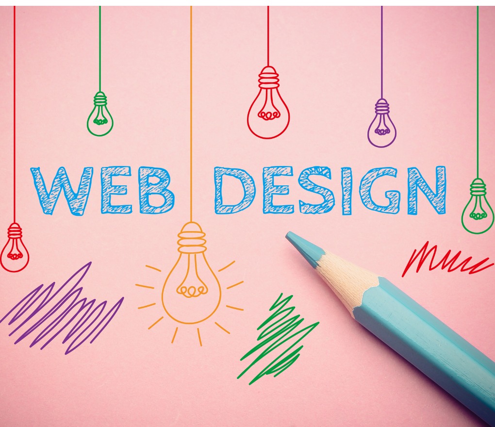
In an attempt to improve your online business presence, you may hire the best content writer in the world. But that can go to waste if you do not focus on the look, feel and functioning of your website. Truth be told, images and videos attract people better than beautifully written, yet mere texts. Your website is the face of your brand online, viewers and visitors will form an impression by what they see on your site and how your website makes them feel.
In today’s world, the creation of a simple one page website is definitely one of the best ways to get one’s name (one’s commercial business’ name, to be precise) on the map of the world wide web. This type of website is relatively affordable and usually doesn’t require the connection of APIs, payment gateways or any kind of advanced features.
With this article, we bring to you a few tips that you can consider as you prepare a one page website design for your business.
The background is an important playground
Creation of a website is an art that allows you to play with creativity and ideas. The background of the homepage shouldn’t intercept the content of the page; that is why choosing a neutral colour is ideal. This could be grey shaded or even pastel toned. Using heavy images or animations is not a good idea as these take longer to load and may not suit every browser. This in turn can slow down the whole site’s performance. Keep the design simple, fresh and unique.
Side navigation labels
As a business owner, you can always decide what kind of navigation you want on your website. In vertical navigation, the menu stays on the left while you can scroll up and down. This technique, however, doesn’t work well on all websites. If you need to provide support to smaller screens with the same menu or you have a lot of texts, then this technique isn’t for your online business. You can have your navigation fixed at the top or you can opt for dot navigation links. Small dots or circles are used for thumbnail preview in dot navigation.
Showcase of products and services
The products and services that you provide should be easily visible on your homepage. The positioning and location of these sections make a lot of difference; the graphical image of your products and their details must be clear and crisp. Think of your viewer to be somebody on the move, make it simple and quick for them. Your display and the access on your website should be intuitive.
Font type and colour code
The font and colour of the content of your website is a part of your branding. What does your brand stand for? Choose a colour and font that best represents your business, at the same time it must blend with your background. Keep up with the trend by following the “minimalist” path; less is more. As for the colour scheme, you can always go with a colour that is pleasing to the eye, avoid neons. If you are using two or more colours, make sure that the shades are close to each other in order to avoid odd arrangements.
Implement call to actions
This is an extremely crucial button that has to be there on your single page website. Call-To-Action is a graphical element, like a button or a hyperlink, that urges and encourages your visitors to perform certain actions such as subscribing to a newsletter or even buying a product or service. Simply put, your CTA must direct a user on what to do next. This is even more important in sales as it can help in increasing sales rate and promotes your product. Your CTA must be concise, logical, compelling and visually outstanding against the background.
Honor the white spaces
Like we have mentioned above, less is definitely more. When you incorporate white spaces on your website, it gives a fresh effect to the overall look of the page. Too many texts and too many images would certainly result in the withdrawal of your visitors. Keep it clean.
Mobile optimization
For this, you can build your website from scratch, based on a custom engine. The key is to create an adaptive design that will automatically sit in accordance with mobile devices. In case you are using an already available CMS like WordPress, there shouldn’t be any problem in adapting it to the mobile version. It is good to remember that most of your visitors would be operating on their smartphones.
Content and graphics go hand in hand, therefore make sure that your content aligns with the images and display. A well designed website will have an impact on your offline and online business performance. It is also important to never stop testing. In order to see how your website is performing, always evaluate conversion paths and see how far your users are scrolling and where they are clicking.
If you require further assistance with building your one page website, do not hesitate to reach out to us. We are a website designing company in Delhi that has been helping businesses develop in all spheres.


